Most of these covers are colorful and are pictures. By using pictures, it makes the book look professional and the saying, "a picture can tell a thousand words" really applies. From a picture I can make so many different predictions about the book and a good picture makes me want to read a book more. All of these covers are in color except for one. The one that isn't in color is interesting because the picture relates to the title. The picture is of a gun pointed right at the reader and it is out there that it makes you want to know what is happening. The only one that isn't a picture is the book, "The Girl with the Dragon Tattoo". I enjoy this cover a lot because it is just a beautiful design. This design is subtle compared to the other books but is just if not more impactful. The colors are eye-catching and the fading dragon in the background makes me stare at it. That cover is my favorite but all the covers are good and pretty.
MuJi's BLoG
Monday, March 16, 2015
Friday, March 13, 2015
Will You Judge?
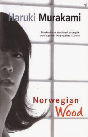
A really good book that I read this year was Norwegian Wood by Haruki Murakami. The cover is of a Japanese girl in black and white. It fits perfectly with the book because the book can get pretty dark at times. There is something about using a picture in a cover that looks professional. The girl is seen near a window almost trapped which matches the theme of the story. Overall, very pretty.
Here's another cover for the same book. Like the previous cover, it is a picture but while the other cover is in black and white, this one is in color. The first was a single person while this cover shows two. This book is kind of a love story so while the other cover portrays a sense of loneliness, this cover portrays love. I think this cover is better because the color pops. It draws more attention to the book and makes someone want to read it more. Not to mention this cover advertises the movie version that is coming soon.
Wednesday, February 4, 2015
I went to the Metropolitan Museum and saw this painting. This painting was very interesting because this painting was made for a friend and corresponded with a poem the friend made. I thought that it was really well made from his use of gradation around the edges. It made the five and the fives in the center the focal point. The reason why I chose this painting to write about was because it was weird. In a gallery full of paintings of buildings and landscapes was the number 5. I liked his use of gold and orange. It looked modern and something that I would hang on my wall.
Tuesday, December 23, 2014
Questions
1)What kind of symbols do you want to be in the logo?
2)Do you want any words within the logo?
3)What colors do you want in the blog?
4)Is there anything that you don't want in the logo?
5)What do you want the logo to represent?
The reason that I chose to do Math Help was because it probably is the only thing that I do after school at school. I'm struggling in math slightly so anything helpful was appreciated. I want to make an awesome logo to represent the group. Math Help is on Tuesdays and Wednesdays open to anyone that wants help or just a place to hang out. It is a nice atmosphere where Ms. Kwan and Ms. Chiu help anyone in need. Even though it isn't an actual graph so many people attend that it can be considered. Since I am there a lot of the time, I am the club.
Friday, December 19, 2014
THE FONT OF THE MILLENNIUM
This is The Font. This font is made of different foods formed to look like letters. I love food so I think this font fits me almost perfectly. Just looking at it makes me hungry so of course it's the best font.
Tuesday, December 16, 2014
Interesting Logo
I think my favorite logo is probably the playstation logo. I've had playstation products from the very beginning and am big fan. The logo itself is a unique logo but in actuality, it is a p and an s underneath the p. You don't notice the P and the S and think of it as a cool symbol. I like how there is depth within the logo. Right next to it says the word PLAYSTATION. The word is written all in one line. It is a very modern font that looks iconic. Get in the game
Wednesday, December 10, 2014
This is the after and before pictures of Chuppa and Max. I added some other pictures like the heads of Kaz and myself. What I wanted to do was make the background as absurd as I could make it then have the faces the only real looking things in the picture. But even then, the people themselves don't look real because they are all blurry. I just wanted to depict my friends and I as weirdly as I could so that they reflect who we are as people. Crazy people no matter where we are.s
Subscribe to:
Comments (Atom)


